Free trial pages and online shopping carts
Problem:
Avalara offered a large variety of products and services, but buying them required calling a sales representative. This tied up resources and was frustrating for prospective customers, who increasingly (and reasonably!) expect to be able to buy things online.
Solution:
During my time at Avalara, I was constantly writing UI text for new free trial and online buy experiences. While all these flows had a similar look, feel, and objective—help a customer or prospect get signed up with minimal friction—each presented unique challenges.
Depending on the product being offered, the customer segment, and how customers entered and exited the flow, the writing for all these pages was distinct. It also required collaboration across teams: I often worked with some combination of product management, engineering, marketing, customer support, and legal.
The work
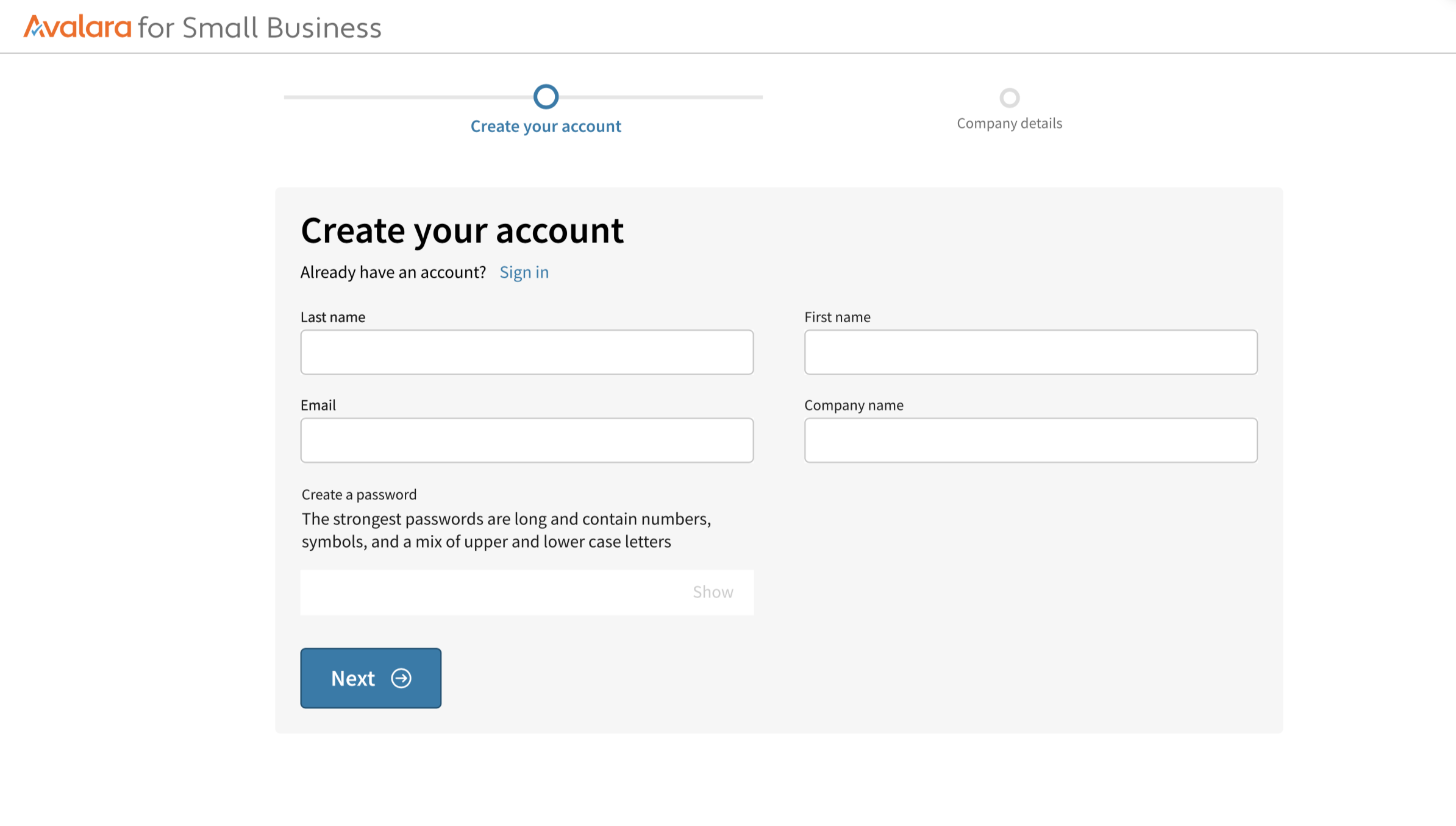
An online shopping cart for the paid version of a tax product


The two-screen flow for the free-trial version of the same product

A contextual in-product promotion for two different tax-return products

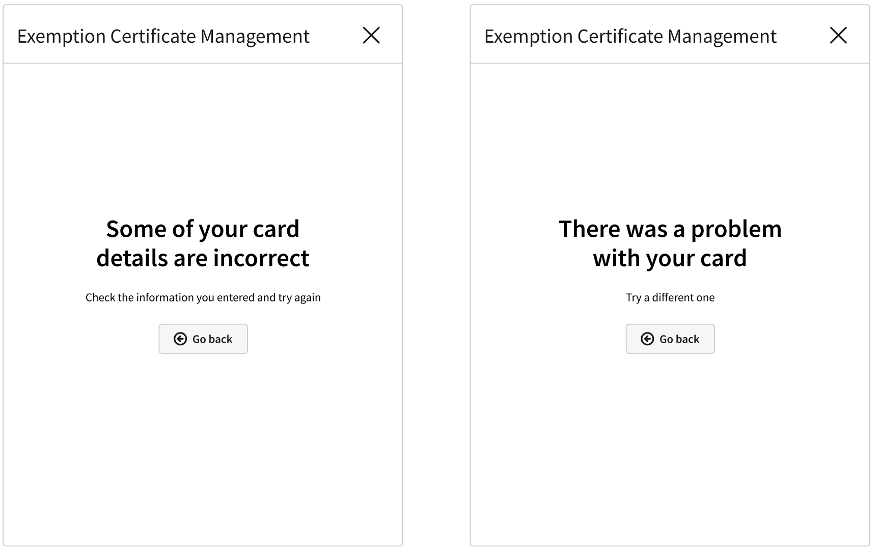
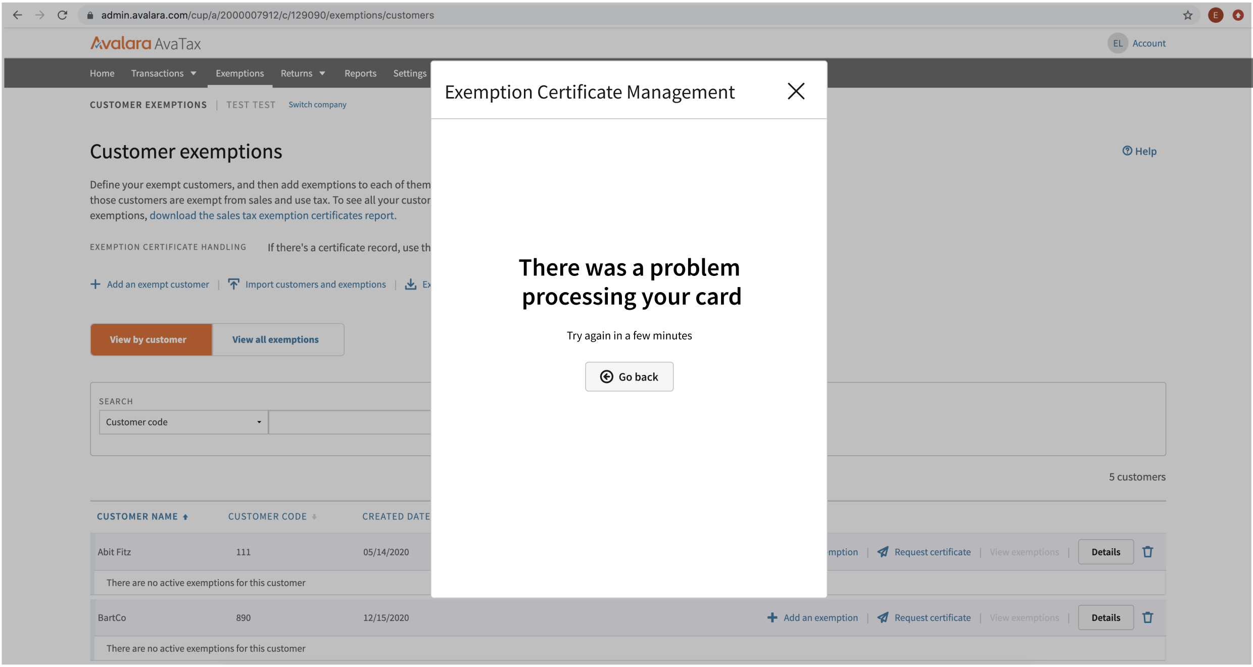
A short flow for buying a tax-compliance product that displays as an overlay to a signed-in customer, as well as some error states


The outcome
Though I didn’t have access to sales metrics, product and sales leadership at Avalara was confident that our work improved and simplified customer experience. By unifying the look, feel, voice, and tone of online buy pages for a diverse array of products and services, this work made it easier for customers to get what they needed and set expectations for how ecommerce should look at a modern SaaS company.